Packaging
Packaging offers unique opportunities in branding as it’s used to:
– Give the product stand out
– Make the product recognisable in-store and online
– Advertise the product in-store on online
– Act as an signal of social status
It has the added benefit of continuing to reinforce the brand after the product has been bought.

Increasing Lypsyl’s market share by over 16%
Lypsyl pioneered the lip salve market in the early 20th century, but its dominance was under threat. We were tasked with a complete redesign.
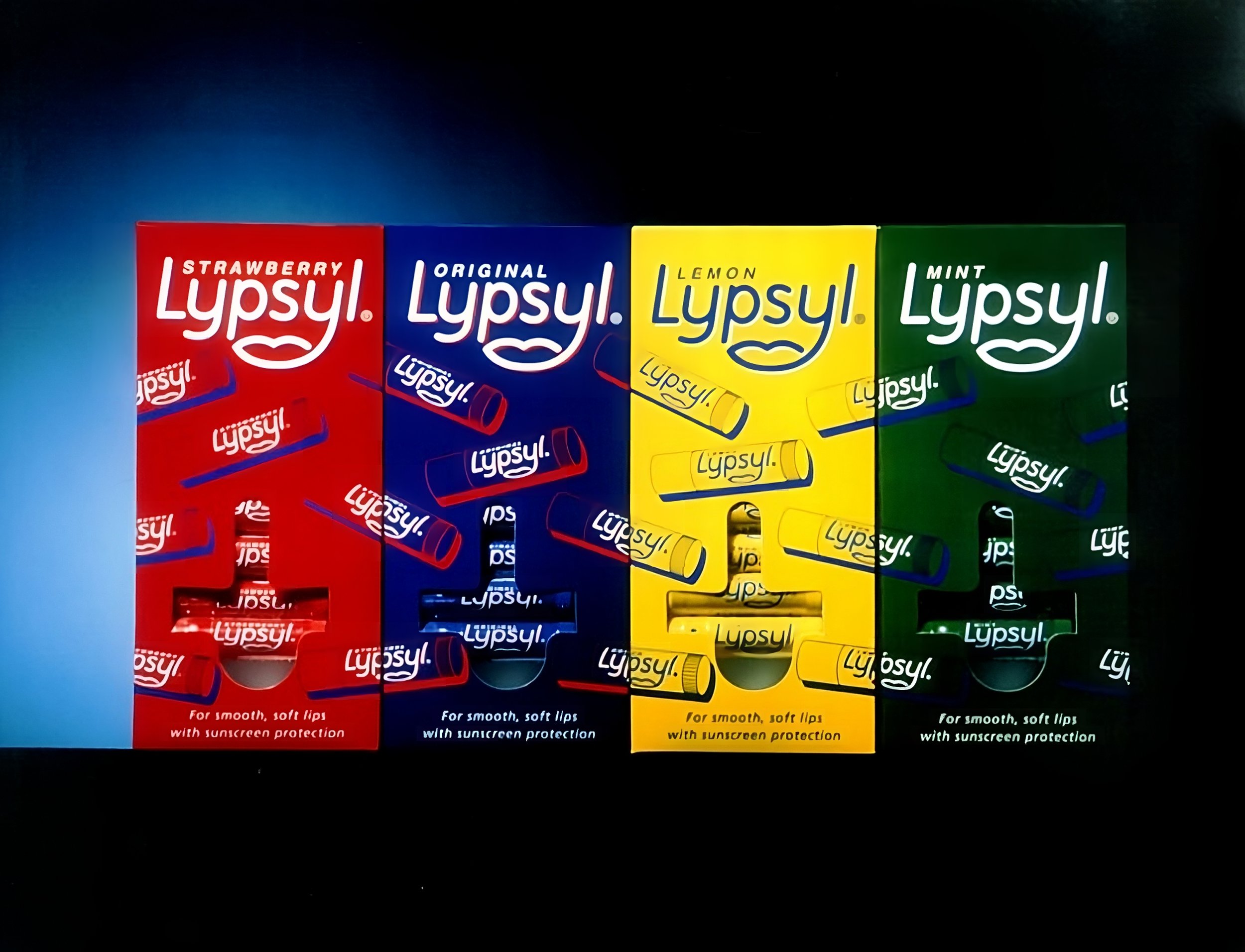
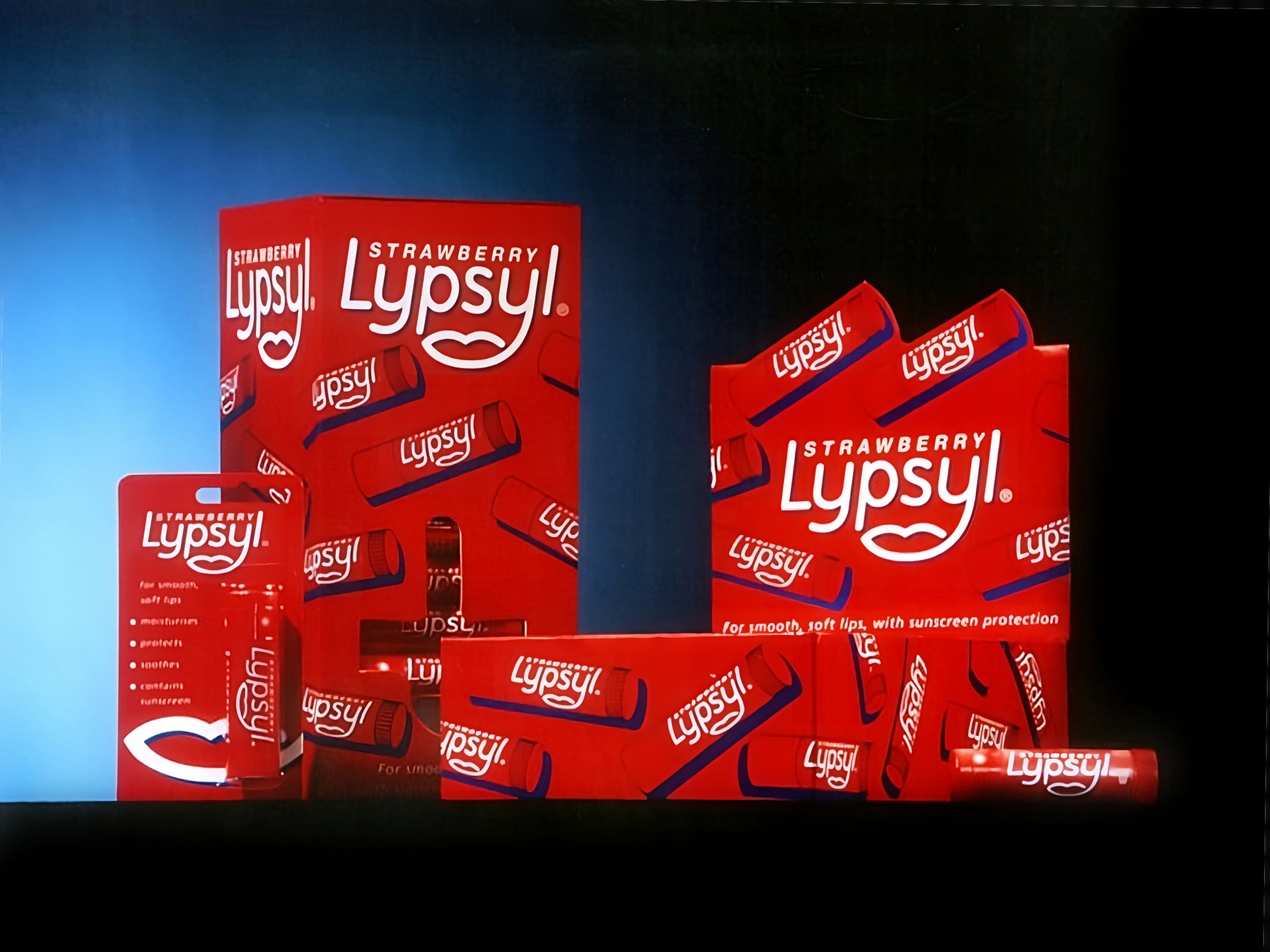
Basic strategy
– Create a distinctive logo – distinct and memorable “lip” mark.
– Give the product in-store and online impact – a single colour pack.
– Give the product shelf presence – distinctive patten across dispensers.
The results
Year-on-year Lypsyl experienced impressive sales growth of 19.6%, surpassing the sector's average growth rate of 15.4%. Lypsyl cemented its market-leading position, accounting for just under a third of all sales. Notably, for every five sticks of Lypsyl sold, its nearest competitor, Chapstick, moved only three units. The redesigned packaging also facilitated Lypsyl’s successful return to its premium positioning, marked by an immediate 5.3% price increase following the relaunch. Perhaps most notably, the investment made in the redesign paid off remarkably quickly, with the costs recouped within a mere five weeks.
"Lypsyl, an old established brand which dominates the market, has successfully protected itself against important competitive innovations with a design-led relaunch that enabled it to maintain its market even with a price increase."
Marketing Week Magazine


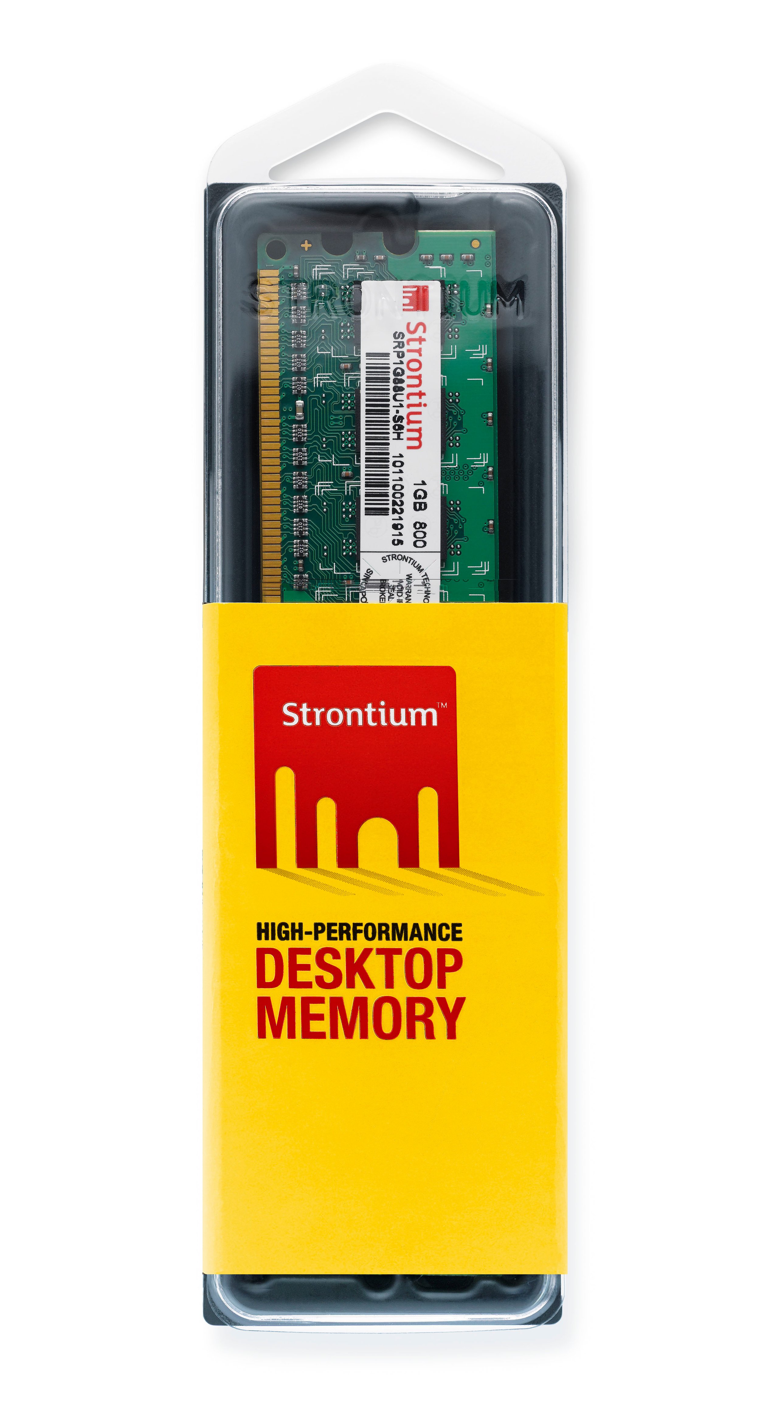
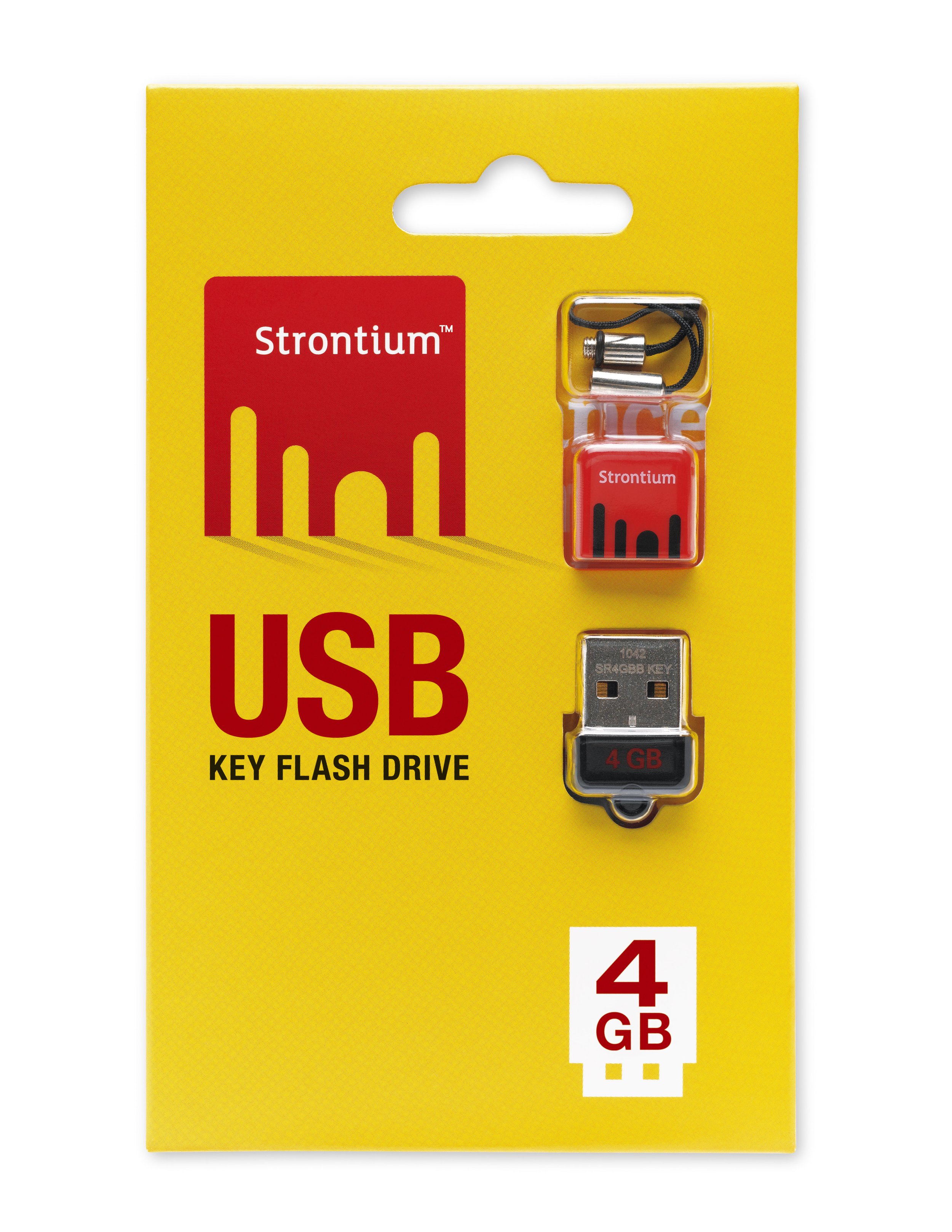
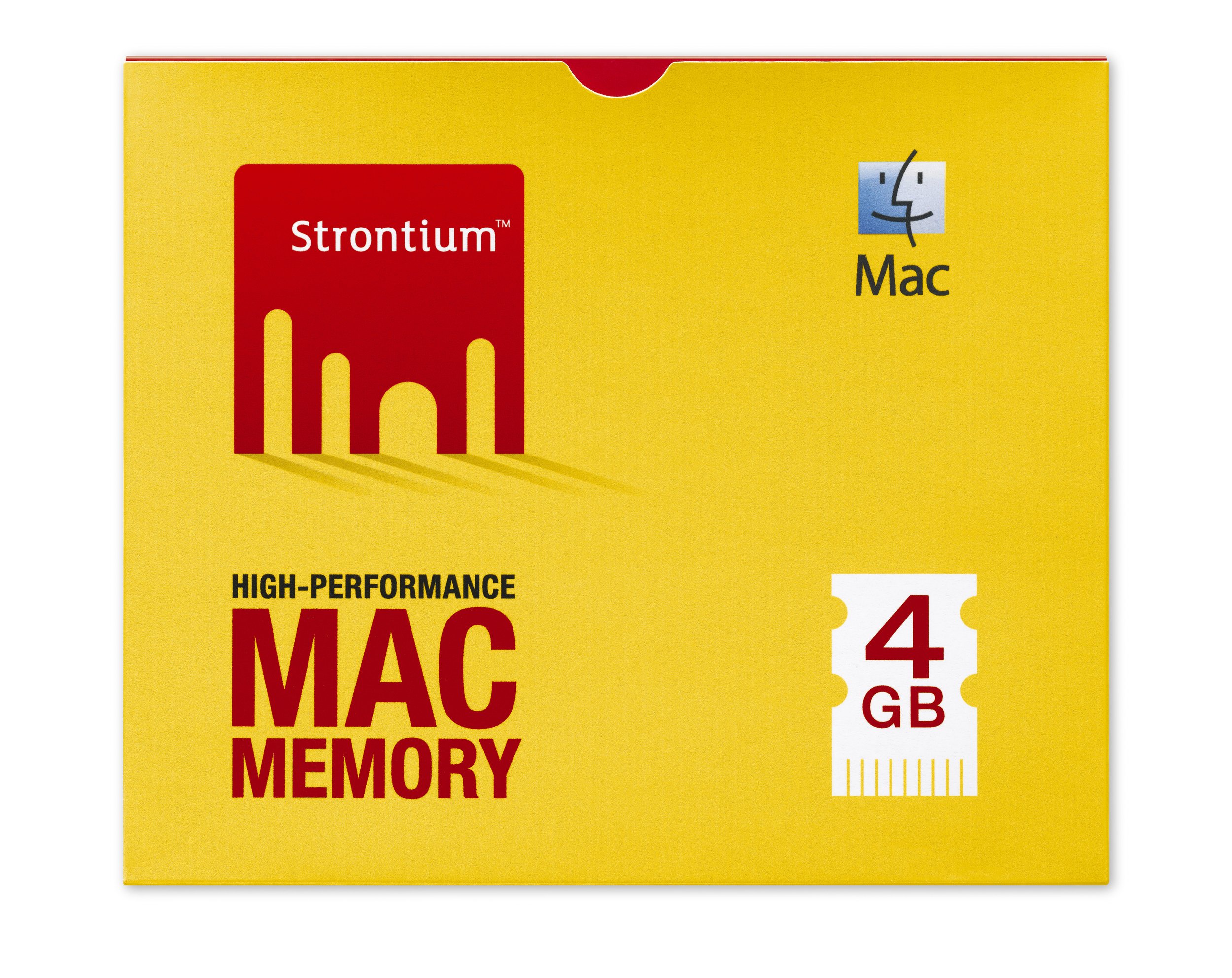
Making Strontium the No.1 seller
When Strontium came to us, their packaging was red, just like all their competitors. We strongly recommended changing to a distinctive brand colour. Within three months, Strontium out-sold Kingston and SanDisk to become the number one memory provider in JB Hi-Fi stores across Australia.
We also redesigned their entire packaging range, making it consistent maximise impact. We placed the product to one side to give more space for branding. And created a system of symbols so consumers could quickly understand the product, its memory size, and usage.